Every time I create charts for visualisation I have a problem choosing appropriate colors for the data. Ever since I started to use ggplot2 the problem went away as ggplot2 tries best to choose appropriate color, and has a wide range of available color themes.
Unfortunately you can’t use ggplot2 all the time, e.g. when you want to plot a dendrogram or use another platform than R. While looking for a way to color my dendrogram with the color choices from ggplot2, I discovered the scales package. scales can be easily used to get the colors from ggplot2, determine breaks for axes or labels.
The following codes plots the colors, with brewer_pal() returning a vector of the requested colors and show_col() plots them.
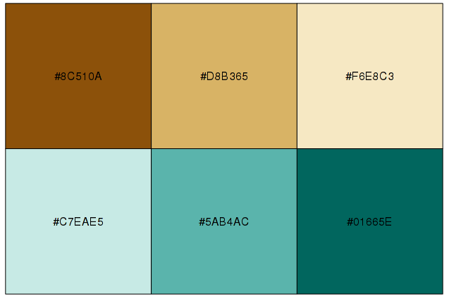
Diverging colors to express similarity in the middle but extreme cases at the beginning and the end:
library('scales')
show_col(brewer_pal('div')(6))
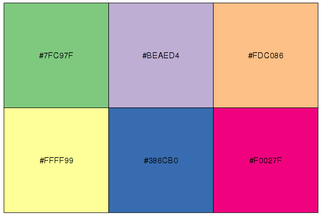
Qualitative pattern to distinguish between different classes:
show_col(brewer_pal('qual')(6))
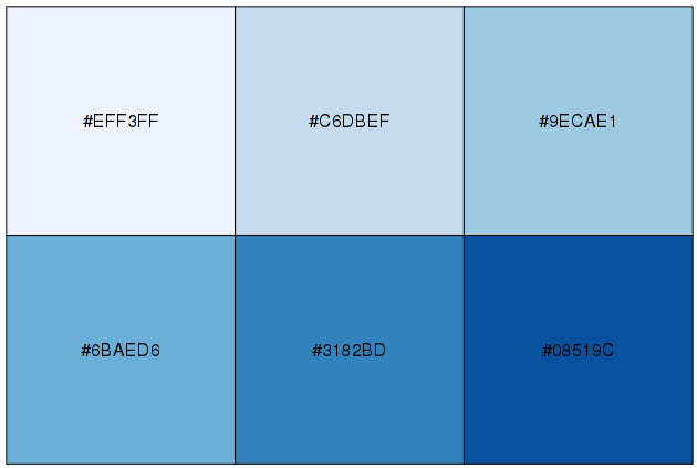
and last but not least, a sequential color palette to express progressing data:
show_col(brewer_pal('seq')(6))