Analyzing rc bug messages
Michael Stapelberg recently posted a blog post about looking into the number of Debian Developers actively working on RC bugs for the upcoming wheezy release.
In this blog post I analyze the data shared by Michael and provide the R commands used to generate the plots & findings. If you are interested into looking into the data yourself, but don’t like R, I suggest using ipython notebook + numpy instead.
Analysis
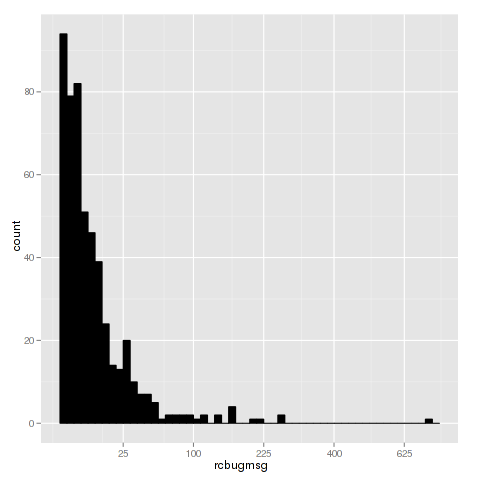
After parsing the data file we typically want to get an understanding of the data, by using summary(bugs) we get the minimum(1), median(5), mean(15.4), max(716) and quantiles of the data. This shows that the number of messages is wide-spread and a few people contribute a lot. To visualize the dispersion of the data we can create a box plot showing the range of messages:

As the first and third quantile are close together we can assume that the majority of the work is done by a few, especially since the second quantile is 5. This is supported by the histogram below, where the x axis is the number of recorded messages and y is the number of developers.
Top 10 contributors
The TOP 10 contributors, according to the dataset, are:
- Lucas Nussbaum - 716 messages
- Gregor Herrmann - 270 messages
- Jakub Wilk - 270 messages
- Andreas Beckmann - 225 messages
- Julien Cristau - 205 messages
- Cyril Brulebois - 169 messages
- Moritz Muehlenhoff - 162 messages
- Michael Biebl - 159 messages
- Salvatore Bonaccorso - 158 messages
- Christoph Egger - 142 messages
r commands
These are the commands used to generate the plots and information in this plot:
bugs <- read.csv("by-msg.csv")
summary(bugs)
boxplot(bugs$rcbugmsg, log='y', range=0, ylab="# bugs")
quantile(bugs$rcbugmsg)
0%  25%  50%  75% 100%
1    2    5   12  716

# create histogram
llibrary('ggplot2')
ggplot(bugs, aes(x=rcbugmsg)) + geom_histogram(binwidth=.5, colour="black", fill="black") + scale_x_sqrt()

top10 <- tail(bugs[order(bugs$rcbugmsg),], 10)
top10