24 April 2013
Visualizing DPL votes
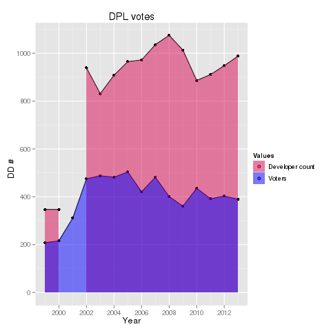
Axel ‘XTaran’ Beckert recently asked in #debian-devel for a visualization of the Debian Project Leader Election results. Unfortunately there seems to be none, except the table in the mail. As I am currently trying to use ggplot2 for more things, I thought I would give it a try and convert the data into a csv file and process the data via R.
For converting the original data i used vim to do a little text processing and created a csv file. By running the following code we can create a nice looking simple graphic:
library("ggplot2")
votes <- read.csv("dpl-2013.csv")
votes2 <- melt(subset(votes, select=c("Year", "DDs", "unique")), id="Year")

p <- ggplot(votes2, aes(Year, value, group=variable, fill=variable)) + ylab('DD #')
p <- p + geom_point() + geom_line() + geom_area(position='identity')
p <- p + scale_fill_manual("Values", values=c(alpha('#d70a53', 0.5),
alpha("blue", 0.5)), breaks=c("DDs", "unique"), labels=c("Developer count", "Voters"))

print(p)
I also created a little script for automatically processing the csv file and creating a similar plot. Feel free to fork/clone extend this script.